[et_pb_section fb_built=”1″ _builder_version=”4.16″ global_colors_info=”{}”][et_pb_row _builder_version=”4.16″ background_size=”initial” background_position=”top_left” background_repeat=”repeat” global_colors_info=”{}”][et_pb_column type=”4_4″ _builder_version=”4.16″ custom_padding=”|||” global_colors_info=”{}” custom_padding__hover=”|||”][et_pb_image src=”https://manuelsuarez.com/wp-content/uploads/2020/03/smh-banner-1.gif” title_text=”smh-banner” url=”https://manuelsuarez.com/the-social-marketing-hour/?utm_source=mswebsite&utm_medium=smh-banner-blogs&utm_campaign=social_marketing_hour” url_new_window=”on” align=”center” _builder_version=”4.16″ _module_preset=”default” global_colors_info=”{}”][/et_pb_image][et_pb_text _builder_version=”4.17.6″ text_font=”||||||||” text_font_size=”18px” background_size=”initial” background_position=”top_left” background_repeat=”repeat” text_text_shadow_style=”preset5″ global_colors_info=”{}”]
This article, and the next couple of articles to follow, will be EPIC. It will be a series that will help you to take your Facebook ads game to the next level. In it, you will learn how to utilize all the different ad formats we’ve been given access to.
After completing this series of articles, you can consider yourself to be in the Top 1% of Facebook Ads marketers, at least when it comes to KNOWLEDGE.

These next few articles are all about “CREATIVES” — This is where you learn how to create a message that gets a response. Once you’ve found your audience, the object of the “game” then becomes to test your creativity and discover what produces the best response; to find what gets someone to be interested, jump in and engage, to opt-in to your funnels, etc.
Cost is an Indicator of CREATIVES Acceptance
Copywriting, single-image and single-video ads, carousel video and image ads, presentation ads, Lead Generation, Store Visits and lots more are covered here!
First, let me give you a simple definition of CREATIVES:
Creatives is a general marketing term referring to the creative aspect and content of a marketing campaign. Creatives are the material used to generate leads, video views, subscribers, and sales. This is something that is usually developed by art directors, creative directors, and copywriters in advertising agencies. In short, a creative is what your audience SEES, formulated with an intent to create a response from your potential customer.
A really good CREATIVE causes a RESPONSE from the audience. A “bad” CREATIVE gets ignored. This includes the videos, images and copywriting used.
In many established organizations, there is a department, completely separate from all other departments, called the CREATIVE department. It is in charge of forming those messages which will create a connection with your brand, then get them to consider your brand, and finally get them closed on becoming your customer.
In small businesses, this department is usually mixed together with the Research department — the ones who find the audience, determine the demand, etc. But it’s a completely distinct area and needs to be given its own attention.
When forming your CREATIVES, the most important tip I could ever give you is to put yourself in the shoes of your audience. If you master this and stop being romantic about your product, you will understand how to communicate with them better and, most importantly, in a way that will make them respond.
When you’re testing your CREATIVES, it is very simple to choose your winner. Which CREATIVE gave you the lowest cost? That’s the one. Why? Because in the Facebook Advertising world, cost per result is the best indicator of creative acceptance.

Facebook is trying really hard to protect User Experience. The way they protect it is by PENALIZING you with a higher cost of advertising when the creative is not being liked by your audience, or REWARDING you with a much lower cost of advertising when your creative is being liked.
It’s a beautiful system. It pushes you to consistently work on improving your CREATIVES. It’s a long-term win-win for your brand and for Facebook.
Today, you will be learning about the different ad formats on the different placements in the Facebook family of apps: Facebook, Messenger, Instagram, Stories, Audience Network, etc…
Here is a very handy resource detailing requirements for the different ad formats on the many different placements: https://www.facebook.com/business/ads-guide
The Art of Copywriting
Now I will share some of the key components of Facebook Ads copywriting — and my recommended best practices.
Before you jump into all of these, I want you to take a moment to read these tips directly from Facebook on the subject of copywriting for your Facebook Ads:
“You don’t have to be a novelist to write copy for an effective Facebook ad. In the last of our series of creative tips, we present a few simple best practices that can help make your copy more effective and consistent.
“Start by considering your tone of voice, which should be a reflection of your business’s personality. Is it funny? All business? Adventurous? Every business has its own identity and, the more authentic you are, the more effective your ads are likely to be. Be yourself and be consistent.
“Remember that people scroll through Facebook quickly, so lead with your most important message. There are also a variety of different ad formats, with different specifications for each. Stick to the important information and pay attention to the character count limit (for ad specs click here). Get the good stuff in before the text is truncated and if you have a specific action you want, be sure to make that part of the ad. For example, Visit our store, Call for a free quote, Check out our website, etc.
“Consider talking about things in terms of your ideal customer’s mindset and what might appeal to them emotionally. Put yourself in THEIR shoes and ask, ‘What would make me like this business? Why would it appeal to me?’
“Give yourself credit for the hard work that you’ve done figuring out the value proposition for your message. This is the statement that often tells people exactly what you do for them. Here are ways to ensure that your message gets through:
* If your copy is too long, make it shorter.
* If it’s all about you as a business, make it about your customer.
* If it’s generic, customize it to speak to your different audiences.
* Come right out and say it.
“Be overt. Don’t make people have to work to figure out what you do. Look at some of your ads and ask yourself, “If I’d never heard of this businesses before, would I understand what they do?” If you’re a florist in San Francisco, don’t write ‘People of San Francisco love us’ and place it next to a picture of flowers. Instead, say something like, “We deliver locally grown flower bouquets anywhere in San Francisco…by bike!”
There you have it. Those are some amazing copywriting tips for your Facebook Ads — directly from the Facebook Creative team. Now let’s keep working on improving that ability.
PRACTICAL: You need to practice this. Either RIGHT NOW — or after you finish reading this article, grab some paper and a pen. Think, for as long as needed, about your potential customers and REALLY try to get in their shoes. Think about how they think… What are their pain points? What do they want? What don’t they want? What problem do you want to help solve for them? Start practicing. This is an ability you have to practice and practice, BUT practice makes perfect.

The Five Elements of Ad Creation
Now, you will learn about the 5 elements to any and all of your Facebook Ads, and I will give you some practical recommendations on using these elements.
Across all formats, these elements will remain consistent — and they are ALL very important in their own right.
Let’s briefly define each:
Text – This is the copy above the image or video. What works well here should be determined through testing. You can test out many variants…Adding a CTA (Call to Action) with a link on it — or NOT adding one, keeping it “short and sweet” or a little more descriptive, etc. You are also allowed to make it long form, meaning you can write a large amount of text on it — though that’s not something I would recommend until you have reached the point of having captured people’s attention enough that they’ll read anything you write.
Your goal in all of this is to give your visitors a compelling reason to act.

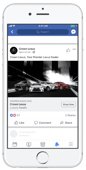
Headline – This is what shows up under the image or video. The character limit for the headline is 40. You can add more text, and go over the character limit, but it may be cut off when people see your ad in certain placements. For example, in Mobile News Feed, You definitely DO NOT want it to be cut off. You want it to be clearly seen. I like capitalizing words in some cases and directing their eyeballs to the call to action with an arrow. Again, the best headlines for your brand will vary and in the end, testing will ALWAYS provide the clear winners.
Your goal here is to grab your visitors’ attention in one line.

Image/Video – This is self-explanatory. Your videos or images are in between your text and headline. You can have a series of images or a series of videos (Carousel ads), or you can have presentations. These examples will be covered later on in this module, but here are some basic video and image recommendations as provided by Facebook:
VIDEO RECOMMENDATIONS:
* Recommended video ratio: Square (1:1) or Vertical (4:5)
* Recommended video length: Less than 16 seconds
* To maximize ad delivery, follow Facebook mobile first best practices.
Image Design Recommendations:
* File type: jpg or png
* Image ratio: 9:16 to 16:9
* Image dimensions: 600×315, 1200×628
* Recommended resolution: Upload the highest resolution image available.
* Images that consist of more than 20% text may experience reduced delivery.
When running a Link Ad (Traffic objective)
* Images cropped to 1.91:1
* Recommended resolution: at least 1,200 x 628px
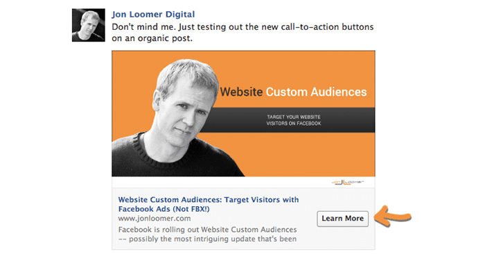
Call to action (CTA) – This is the action you want people to take. Facebook is currently testing this out and they will soon open it up for customization. Meaning, you will be able to enter in there the text you would like to display. As of today, there are standard options you must choose from. The CTA shows up in your Facebook ads to the right of the Headline and Description and will link out to your website, Amazon or Messenger channel.

These CTAs are not ALL available for all objectives standardly. They will vary depending on the objective you choose.
These CTAs are available on a drop-down menu at the ad level. A few examples are: Subscribe, Apply now, Book now, Contact us, Shop now, Learn More, Send Message, Download, Donate, Sign Up, Contact Us.
Description – The Description is to add additional text to emphasize why people should visit your website or engage with your brand. This won’t appear in all placements. This description appears right under your Headline and you should work on keeping it at 30 characters or less. Observing the Ad Preview at the Ad Level will help you ensure that it does not get truncated.
I know that Facebook has also been testing quite a bit with this. Sometimes you will see it show up in the mobile newsfeed now. Just a year ago the descriptions would only show up on desktops, but as you know, Facebook is constantly changing things for us, especially everything trending toward mobile. Expect this to be an important element as Facebook makes this a more visible part of your Facebook ads.
By the end of this mini-series of articles, you will have a full certainty of these 5 elements and how to get the most out of each one.
Now, if you haven’t taken the time to grab that pen and paper and do the PRACTICAL “assignment” that I suggested under “The Art of Copywriting” section, I strongly advise you DO IT NOW. Remember that PRACTICE initially makes PROGRESS, and consistent practice progresses to PERFECTION and MASTERY.
I look forward to sharing more with you in Part 2. See you there.
[/et_pb_text][/et_pb_column][/et_pb_row][/et_pb_section]