In this article I cover the importance of ADVERTISING CREATIVE that produces a response. Facebook gives you access to certain metrics that will tell you right away if your audience is accepting the message well. The main metric is RELEVANCY SCORE. You can access this data through your Facebook Ads Manager dashboard at the Ad Level.
What is CREATIVE and how do I use it?
Let me give you a simple definition of CREATIVE:
Creative is a general marketing term referring to the aspect and content of the marketing campaign. Creative is the material used to generate leads, video views, subscribers, and sales. This is something that is usually developed by art directors, creative directors, and copywriters in advertising agencies. In short, a creative is what your audience SEES, formulated with an intent to create a response on your potential customer.

A really good CREATIVE causes a RESPONSE from the audience. A “bad” CREATIVE gets ignored. This includes the videos, images and copywriting used.
In established organizations, there is a department, completely separate from all other departments, called the CREATIVE department. It is in charge of forming those messages that will create a connection between the public and your brand, then getting them to consider your brand, and finally getting them closed on becoming your customer.
In small businesses, this department is usually mixed together with the research department — the ones who find the audience, determine the demand, etc. But it’s a completely distinct area and needs to be given its own attention.
When forming your CREATIVE, the most important tip I could ever give you is put yourself in the shoes of your audience. If you master this, and stop being romantic about your product, you will understand how to communicate with them better and, most importantly, in a way that will make them RESPOND.
When testing your CREATIVE it is very simple to choose your winner. Which CREATIVE gave you the lowest cost? That’s the one. Why? Because in the Facebook Advertising world, cost per result is the best indicator of creative acceptance.
Facebook is trying really hard to protect the UX (User Experience). The way they protect it is by PENALIZING you with a higher cost of advertising when the creative is not being liked by your audience, or REWARDING you with a much lower cost of advertising when your creative is being liked.
It’s a beautiful and almost perfect system. It pushes you to consistently work on improving your CREATIVE and it’s a long-term win-win for your brand and Facebook.
Advertising in this modern era is, without question, a whole new experience. If you are one of the unfortunate people who graduated college with a marketing degree, you will have to press the reset button. Most of the RULES and direct-selling philosophy taught in universities DO NOT WORK today.

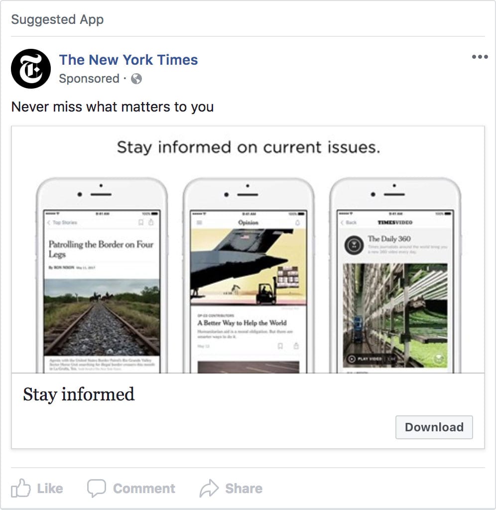
An example of a Facebook Ad form The New York Times
The Five Elements of Ad Creative for Facebook and Instagram
When it comes to AD CREATIVE there are 5 elements to any and all of your Facebook and Instagram Ads. Here I’ll give you some practical recommendations on using these elements.
Across all formats, these elements will remain constant — and they are ALL very important in their own right.
Let’s briefly define each:
Text: This is the copy above the image or video. What works well here should be determined through testing. You can test out many variants. Adding a CTA with a link on it or not adding it, short and sweet or a little more descriptive, etc. You are also allowed to make it long form, meaning you can write a large amount of text on it — though that’s not something I would recommend until you’ve captured people’s attention enough that they will read anything you write.
Your goal in all of this is to give your visitors a compelling reason to act.
Headline: This is what shows up under the image or video. The character limit for the headline is 40. You can add more text, and go over the character limit, but it may be cut off when people see your ad in certain placements, for example, Mobile News Feed. You definitely DO NOT want it to be cut off. You want it to be clearly seen. I like capitalizing words in some cases and directing their eyeballs to the call to action with an arrow. Again, the best headlines for your brand will vary and, in the end, testing will provide the clear winners.
Your goal here is to grab your visitors’ attention in one line.
Image/Video: This is self-explanatory. Your videos or images are in between your text and headline. You can have a series of images or a series of videos (Carousel ads), or you can have presentations. These examples will be covered later on in this module, but here are some basic video and image recommendations provided by Facebook:
Video Recommendations:
- Recommended video ratio: Square (1:1) or Vertical (4:5)
- Recommended video length: Less than 16 seconds
- To maximize ad delivery, follow Facebook mobile first best practices.
Image Design Recommendations:
- File type: jpg or png
- Image ratio: 9:16 to 16:9
- Image dimensions: 600×315, 1200×628
- Recommended resolution: Upload the highest resolution image available.
- Images that consist of more than 20% text may experience reduced delivery.
When running a Link Ad (Traffic objective):
- Images cropped to 1.91:1
- Recommended resolution: at least 1,200 x 628px
Call to action (CTA): This is the action you want people to take. Facebook is currently testing this out and they will soon open it up for customization. Meaning, you will be able to enter in there the text you would like to display. As of today, there are standard options you must choose from. The CTA shows up in your Facebook ads to the right of the Headline and Description and will link out to your website, Amazon or Messenger channel.
These CTAs are not ALL available for all objectives standardly. They will vary depending on the objective you choose.
These CTAs are available on a drop-down menu at the ad level. A few examples are: Subscribe, Apply Now, Book Now, Contact Us, Shop Now, Learn More, Send Message, Download, Donate, Sign Up, Contact Us.
Description – The Description is to add additional text to emphasize why people should visit your website or engage with your brand. This won’t appear in all placements. This description appears right under your Headline and you should work on keeping it at 30 characters or less. Observing the Ad Preview at the Ad Level will help you ensure that it does not get truncated.
I know that Facebook has also been testing quite a bit with this. Sometimes you will see it show up in the mobile newsfeed now. Just a year ago the descriptions would only show up on desktops, but as you know, Facebook is constantly changing things for us, especially everything trending toward mobile. Expect this to be an important element as Facebook makes this a more visible part of your Facebook ads.
Only Two things…
In the end, Facebook will tell you if what you’re building is good or bad. There’s only 2 things that can be wrong with your campaigns…
Your Audience (You are marketing a hair loss formula to a hairy crowd) or your CREATIVE.
Fix one of the above over and over as many times as necessary and I guarantee you will find winning campaigns you can scale. The biggest flaw I have seen consistently with advertisers is LACK OF PATIENCE. I would tell you that as a bell weather, be ready to have 20 losing campaigns before you have 1 mega winner you can scale.
If you haven’t done so yet, get your Facebook Business Manager setup and start testing. There’s nothing like being deep in the trenches yourself and exploring the power and potential of the Facebook advertising opportunity.

Here is a very handy resource detailing requirements for the different ad formats on the many different placements: https://www.facebook.com/business/ads-guide.
Let me know any what you thought and any questions you have in the comments!


