[et_pb_section fb_built=”1″ _builder_version=”4.16″ global_colors_info=”{}”][et_pb_row _builder_version=”4.16″ background_size=”initial” background_position=”top_left” background_repeat=”repeat” global_colors_info=”{}”][et_pb_column type=”4_4″ _builder_version=”4.16″ custom_padding=”|||” global_colors_info=”{}” custom_padding__hover=”|||”][et_pb_image src=”https://manuelsuarez.com/wp-content/uploads/2020/03/smh-banner-1.gif” title_text=”smh-banner” url=”https://manuelsuarez.com/the-social-marketing-hour/?utm_source=mswebsite&utm_medium=smh-banner-blogs&utm_campaign=social_marketing_hour” url_new_window=”on” align=”center” admin_label=”Image” _builder_version=”4.16″ _module_preset=”default” global_colors_info=”{}”][/et_pb_image][et_pb_text _builder_version=”4.17.6″ text_font=”||||||||” text_font_size=”18px” background_size=”initial” background_position=”top_left” background_repeat=”repeat” global_colors_info=”{}”]

Here’s a truth to face.
You create an ad to promote your business on social media because sales are sluggish.
You’re super proud of the ad you created but, sales are still slow in your business and if they stay the same you might be forced to close. Even though you believe your ad is awesome, the truth is… it needs to change.

Many of us face the problem of being overly romantic about a piece of marketing we created even if its performance is low.
So, we need a non-emotional way to help us make the decision to either replace the ad or put more money behind it.
So, how do you do it?
Testing, Testing, Testing
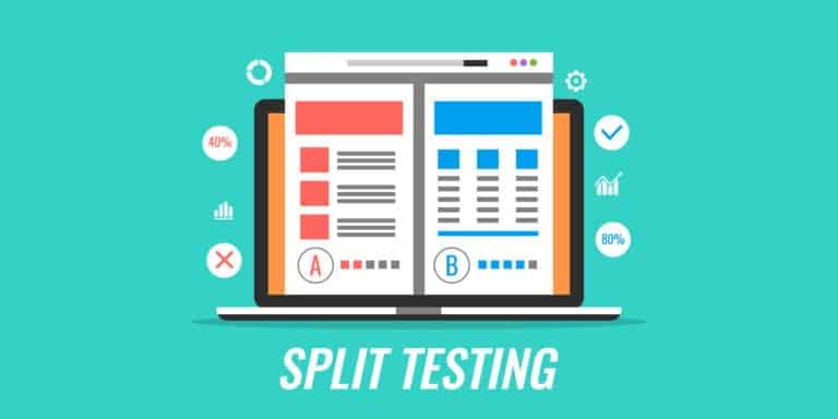
Split testing is your answer.
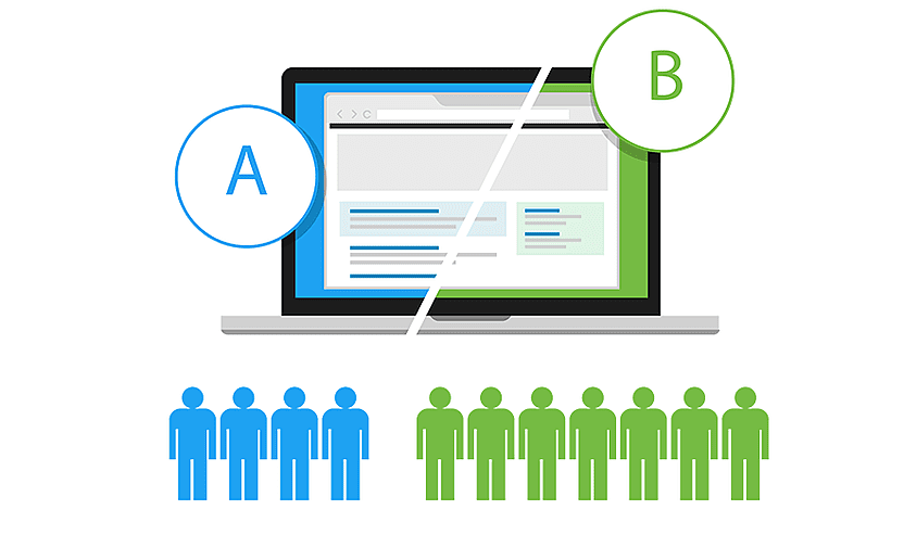
It allows you to test one piece of marketing material against another to see which one gets a better response from your audience. The better your audience’s response, the more attention you get on your business. The greater the attention you get on your business the greater your chances of making sales.
You can think of split testing as your secret marketing weapon, optimizing how and where you invest your advertising money.
But that’s not all.
Split testing your marketing materials allows you to smooth out your customers’ experience. The easier you make it for your customers to buy, the more often they‘re willing to buy from you.
I’ve got one HUGE tip for you. Are you ready for it?
Only change 1 item at a time when you’re split testing. That way you know exactly what’s working, and what isn’t.
This is a shortlist of 8 items you can easily split test to help people do even more business with you.
1. Font and Size

Arial, Verdana, Comic Sans…Oh My!
What is the best font and font size to use? “It depends!” That might sound like a cheap answer but it’s true. For someone to say he knows the best choice is just pushing his opinion. Your market is going to determine what’s best by the way they respond.
If you’re sending a message about a children’s party then you might have great success with comic sans. Try sending a message to a group of doctors in comic sans and they’ll probably never talk to you again.
The goal is to make your message easy to read and to communicate your message in a way that makes your audience feel good about you.
2. Background
Simple is better.
Yes, the tiled background looks cool but your prospects could find it distracting. If your prospects get distracted the chance of them leaving your webpage without taking the actions you want goes sky high.
Same with colors. You can skip the hot pink, sunlight yellow, and neon green. If you have specific brand colors, then absolutely use them, but keep the background simple and neutral.
3. Autoplay Media
To play, or not to play? That is the question.
There are consumers that feel violated by audio and video that fires off without consent. If your media launches automatically on an unsuspecting viewer it could kill the sale right there. That might seem petty but it’s true.
How are you going to know what your audience prefers? You guessed it, split test, my friend.
4. Header

Does it serve the purpose?
The header is another place where you might get overly romantic about your logo or branding, and you often see website navigations buttons here too. Ask yourself this, does it serve the purpose of the webpage?
If the page is about collecting information and you want the prospect to give you a name and email in exchange for something they find valuable, then having buttons about anything else can sabotage your results.
Remember the saying: A confused mind never buys.
Give them only what they need to get what they want.
5. Proven Headlines
Grab ‘em and make an offer!
This is the first and maybe the most powerful piece of communication your prospects see when landing on your website. If you’re new to the idea of attracting people with words, let me offer you some help.
Here are some plug and play headline formulas you can use today.
How to [do/get awesome thing] without [experiencing pain and discomfort]
X Ways to Do Z
The Truth About XYZ
They All Laughed When I [said I could do something] but When I Started to [do the thing] they weren’t laughing anymore (This is a classic)
Keep this in mind: Headlines are a great place to mention big benefits of your product or service in such a way that creates some curiosity from the reader.
6. Proven Subject lines

The headline of your emails.
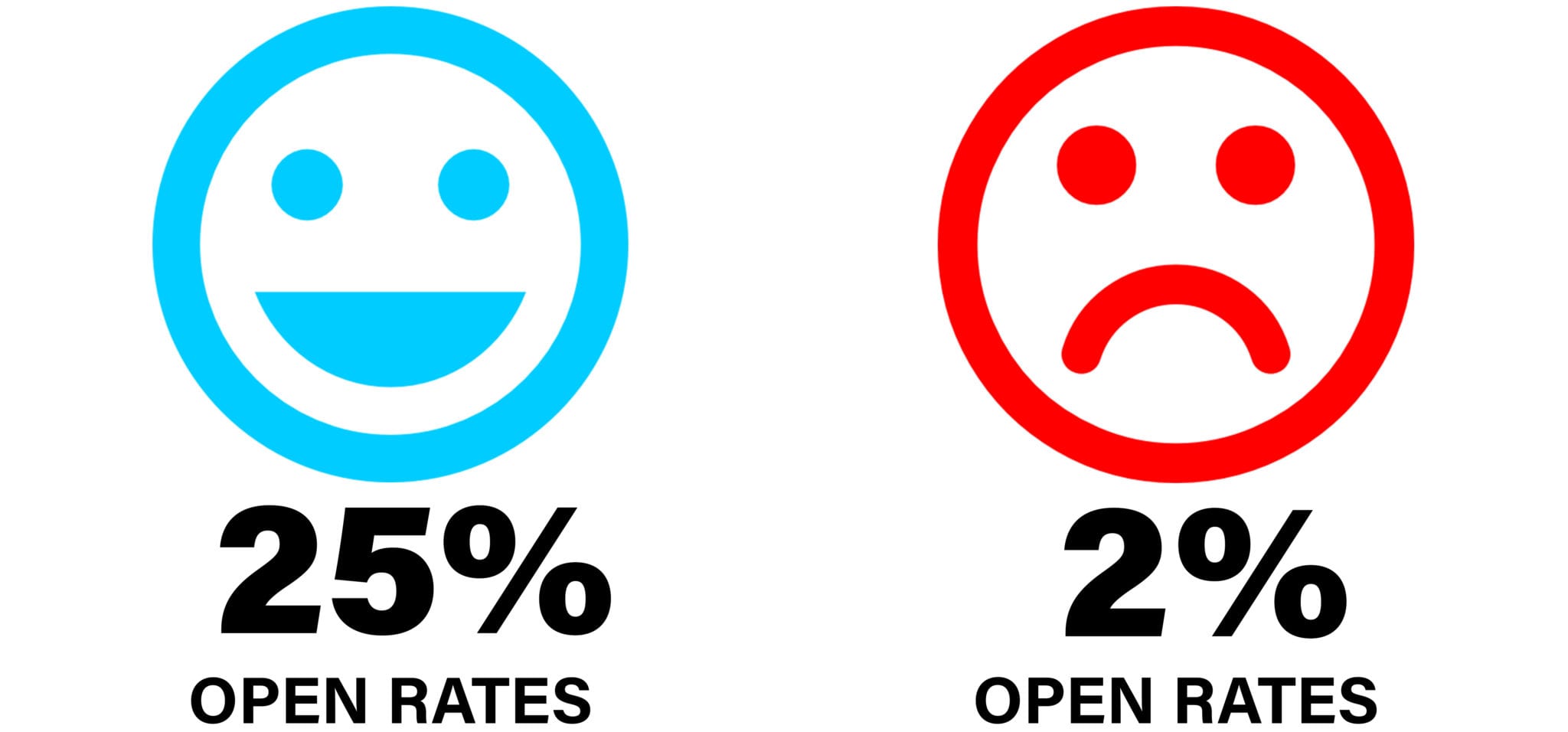
Here is another great place to experiment with split testing. Imagine you send an email and only 20 % of your list opens it. Then you change only the subject line send it to the remaining 80% that didn’t open the first email and another 37% of list open the second one.
As with headlines you can follow formulas to create your subject lines. Here are some examples:
Do you still need help with ZZZ
That’s it, I quit!
Open this if you want ZZZ
Don’t open this if you want ZZZ
My weird little trick to…
7. High-Quality Product Images

Is a picture worth $1000?
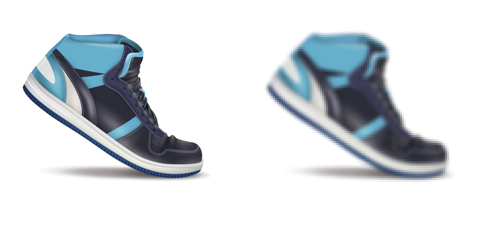
Your ads might be great. Your webpage’s background, header, headline, and media all could be great. But if the image of your product is bad, you can virtually hear people hit the brakes and bounce away from your page. Besides they want to get back to looking at cats and dogs on Instagram.
8. Name Collection

Are you trying to steal my identity?
Before people know who you are, they may be willing to give you an email but feel hesitant about giving their name. Depending on where people connect with you might change what information they’re willing to give you.
If you connect with people via Facebook messenger, the way I frequently talk about, you’ll be able to see all of their Facebook info.
If you’re collecting information from a webpage, you can experiment with just asking for their email. You can always get their name later after you’ve warmed them up through your communications.
And once you discover a winner with split testing, you can cut out the loser and create a new piece to test against the winner.
Happy testing, my friend!
[/et_pb_text][/et_pb_column][/et_pb_row][/et_pb_section]
Wow, this article is awesome! Thanks for pointing me in the right direction. This really makes sense!
This was really helpful information! Thank you!
You’re very welcome! 🙂
It’s always really neat to see how different things work for different audiences. This is really helpful because I never thought something like font size would change the whole outcome of an ad… that’s crazy cool.
Thank you! 🙂
Wow, I read this a while back and it’s still VALUABLE information. I came back to read through it again to keep up with my marketing techniques.
Thank you, Manuel!
Thank you!